
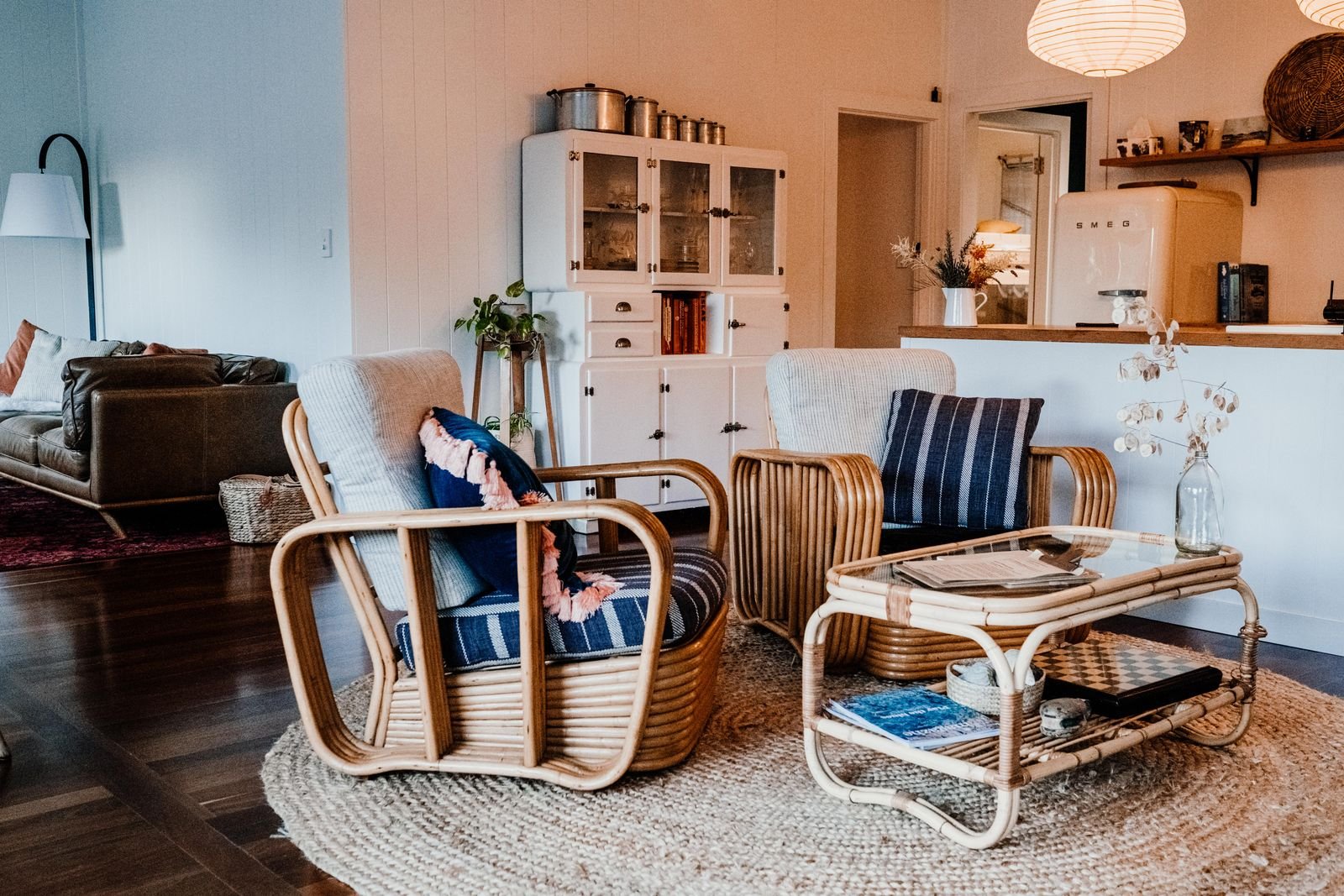
Terracotta has become one of the most loved colors in home design, and for good reason. Drawn from natural clay, its warm blend of orange, red, and brown feels grounding, cozy, and timeless, bringing an earthy warmth to a room that cooler palettes simply cannot. Best of all, it is remarkably easy to work with once you know which tones to pair it with.
These ideas show how to build a terracotta color palette that feels warm and layered rather than heavy, from the neutrals and natural materials that ground it to the complementary tones and accents that bring it to life. Use the ones that suit your space and your light.
What colors go well with terracotta?
Terracotta is a warm, earthy tone, so it pairs best with other natural colors. The trick is to balance its warmth with soft neutrals and a few cooler or deeper accents so the palette feels rich and considered rather than one-note.
- Warm neutrals: cream, beige, and warm white let terracotta stand out while keeping the room light and airy.
- Natural wood and rattan: wood tones and woven textures echo terracotta earthy roots and add depth.
- Earthy greens: olive, sage, and moss are natural companions that feel fresh against the warmth.
- Cool and deep accents: dusty blue, blush, black, and brass add contrast and stop the palette from feeling flat.
1Pair terracotta with warm whites and creams
Warm whites and creams are the easiest partners for terracotta, giving the eye somewhere to rest and keeping the room bright. This pairing lets the terracotta feel like a considered accent rather than an overwhelming wash of color.
2Ground the palette with natural wood
Wood tones share terracotta earthy quality and anchor the whole scheme. Oak, walnut, and warm mid-tone woods in flooring, furniture, or shelving make terracotta feel intentional and rooted in nature.
3Balance with soft, earthy neutrals
Beige, taupe, and greige soften a terracotta palette and keep it from feeling too warm. Using these on larger surfaces lets you enjoy terracotta as an accent without the room feeling closed in.
4Combine terracotta with olive or sage green
Earthy greens are terracotta natural complement, echoing the pairing of clay and foliage found in nature. Olive, sage, and moss add a fresh, grounding balance that keeps the palette feeling alive.
5Layer tonal shades of terracotta
Using several shades, from pale clay to deep rust, adds depth and a collected feel. Layering tones through cushions, throws, and pottery creates richness without introducing competing colors.
6Try a terracotta accent wall
A single terracotta wall makes a warm, enveloping statement without committing the whole room. It works especially well behind a bed, sofa, or dining table, framed by neutral walls and natural wood.
7Keep large furniture neutral
Keeping sofas, beds, and big cabinets in neutral tones gives you flexibility and keeps the room calm. Terracotta then comes in through accents you can easily swap, making the palette adaptable over time.
8Add rust and burnt orange for depth
Deeper rust and burnt-orange tones add richness and dimension to a terracotta scheme. Used in a rug, artwork, or a velvet cushion, they make the warmer shades feel layered rather than uniform.
9Pair with dusty pink and blush
Soft blush and dusty pink sit in the same warm family as terracotta and add a gentle, sophisticated contrast. Together they create a calm, welcoming palette that feels modern and inviting.
10Add brass and gold metallics
Warm metals like brass, bronze, and gold catch the light and enhance terracotta glow. Introduce them through lighting, frames, or hardware for a touch of warmth and polish.
11Introduce black for definition
A little black grounds a warm palette and adds crisp contrast. Black picture frames, a lamp, or slim metal details keep a terracotta room from feeling hazy and give it structure.
12Bring terracotta in through textiles
Cushions, throws, rugs, and curtains are the easiest, lowest-commitment way to add terracotta. Textiles let you build the palette gradually and adjust it with the seasons.
13Use terracotta tile or a clay floor
Terracotta tile brings authentic, textured warmth to floors, backsplashes, and entryways. Its natural variation adds character and pairs beautifully with wood, plaster, and neutral walls.
14Add plenty of natural texture
Jute, rattan, linen, and clay reinforce the earthy feel of a terracotta palette. Layering these textures adds depth and keeps the scheme feeling organic and relaxed.
15Balance with a touch of muted blue
Dusty or muted blue is a natural opposite to terracotta and adds a cooling, balancing note. A few blue accents keep a warm room feeling fresh rather than heavy.
16Display terracotta pots and ceramics
Clay pots, stoneware, and ceramic vases are a simple way to weave terracotta through a room. Grouped on a shelf or table, they add authentic color and handmade character.
17Add greenery to complement the warmth
Living plants look especially good against terracotta, echoing the clay-and-foliage pairing of nature. Greenery adds freshness and softens the warm tones beautifully.
18Use terracotta in art and prints
Artwork and prints featuring warm, earthy tones tie a palette together and add a focal point. Abstract shapes, desert landscapes, and botanical prints all suit the terracotta mood.
19Paint a piece of furniture terracotta
A terracotta-painted sideboard, chair, or door adds a confident pop of color in a contained way. It is a reversible way to test the shade before committing to more.
20Warm the lighting to enhance the tones
Warm-white bulbs and soft, layered lighting make terracotta glow, while cool light can flatten it. Lamps, candles, and dimmers help the palette feel its cozy best in the evening.
21Build the palette one room at a time
Rather than spreading terracotta thinly through the whole house, commit to it in one room and let it shine. A focused, well-layered palette feels far more intentional than scattered touches everywhere.
Frequently Asked Questions
What colors go well with terracotta?
Terracotta pairs beautifully with warm whites, cream, and beige, natural wood, and earthy greens like olive and sage. For contrast, add dusty blue, blush pink, black, or brass, all of which balance its warmth and keep the palette from feeling flat.
Is terracotta a warm or cool color?
Terracotta is a warm color, drawn from natural clay with red, orange, and brown undertones. That warmth is why it feels cozy and grounding, and why it works so well alongside other earthy, natural tones.
How do I use terracotta without it feeling overwhelming?
Keep large surfaces such as walls and big furniture in neutrals, and bring terracotta in through accents like cushions, throws, art, and pottery. If you want more, an accent wall or a single statement piece adds impact while staying balanced.
What rooms work best with a terracotta palette?
Terracotta suits almost any room, but it is especially welcoming in living rooms, bedrooms, and dining spaces where warmth is a plus. It also works beautifully in kitchens and entryways through tile, pottery, and textiles.
Does terracotta go with grey?
Yes. Warm greys and greige are a natural match for terracotta, softening its warmth and keeping the look modern. Very cool, blue-based greys are best avoided, as they can clash with the earthy tone.
Final Thoughts
A terracotta palette brings instant warmth and a grounded, natural feel to a home. Anchor it with soft neutrals and natural wood, layer in complementary earthy tones, and use terracotta as an accent through textiles, pottery, and art. The result is a space that feels cozy, timeless, and full of quiet character.
Discussion